Interactive data exploration using Pandas, Elasticsearch, and D3
Example Project:
Exploring all domestic US flights
for 2001

The raw data
approx. 6 million data sets
> wc -l 2001.csv
5967781 2001.csv
approx. 600 MB of data
> ls -hl 2001.csv
573M Jan 10  2016 2001.csv
29 colums, data has gaps, but looks consistent
> head 2001.csv
Year,Month,DayofMonth,DayOfWeek,DepTime,CRSDepTime,ArrTime,CRSArrTime,UniqueCarrier,FlightNum,TailNum,ActualElapsedTime,CRSElapsedTime,AirTime,ArrDelay,DepDelay,Origin,Dest,Distance,TaxiIn,TaxiOut,Cancelled,CancellationCode,Diverted,CarrierDelay,WeatherDelay,NASDelay,SecurityDelay,LateAircraftDelay
2001,1,17,3,1806,1810,1931,1934,US,375,N700��,85,84,60,-3,-4,BWI,CLT,361,5,20,0,NA,0,NA,NA,NA,NA,NA
2001,1,18,4,1805,1810,1938,1934,US,375,N713��,93,84,64,4,-5,BWI,CLT,361,9,20,0,NA,0,NA,NA,NA,NA,NA
2001,1,19,5,1821,1810,1957,1934,US,375,N702��,96,84,80,23,11,BWI,CLT,361,6,10,0,NA,0,NA,NA,NA,NA,NA
2001,1,20,6,1807,1810,1944,1934,US,375,N701��,97,84,66,10,-3,BWI,CLT,361,4,27,0,NA,0,NA,NA,NA,NA,NA
No specific task or question
Exploring what just might be interesting
Finding the unknown unknowns
Why not just load it into Excel and fiddle about?
You simple can not
too large
and even if you could: way too slow
even if it was fast enough: does not run in the Browser
even if it does (360 or Google Sheets): is it most interactive?
No known interactive out-of-the-box tool to efficiently work on that
Other Standard tools
- Excel (2011 Mac): truncates
- loads data relatively fast
- truncates after 1M lines
- Google Sheets: nope
- limited to 2.000.000 cells (not lines)
- does not load data at all
- Numbers (Mac): truncates
- loading takes long
- truncates after 64k lines
- Emacs: Low-level operations possible
- loads data very fast with almost no memory overhead
- all operations work smoothly, even editing and saving
Content
- Pandas: Preparing the data
- Elasticsearch: Store data and deliver digestible data chunks
- D3 with crossfilter and DC: Display data interactively
- Some data exploration
I: Data Wrangling with Pandas
Preparing the data
Kudos to Chi Nhan Nguyen for technical support on this section
Introducing Pandas and friends
All live in the Python world
- http://pandas.pydata.org/: data structures and data analysis tools
- http://www.numpy.org/: fundamental package for scientific computing
- http://matplotlib.org/: 2D plotting library
- https://stanford.edu/~mwaskom/software/seaborn/: statistical data visualization
Step 1: Analysing Samples
Working on a reduced number of random samples
- How is the data quality (e.g. missing or wrong data)?
- Is the data plausible?
- What might be interesting to explore?
Sample Code: Analysis
Reading sample data
s = 10000 # desired sample size
n = 5967780 # complete data size
skip_rows = sorted(numpy.random.choice(np.arange(1, n + 1), (n - s)))

# pandas dataframe (2-dim table structure)
df = pandas.read_csv('../../data/2001/2001.csv', skiprows=skip_rows)
Sample Code: Creating Correlation Chart
cols_for_correlation = [
    'DayOfWeek', 'DepTime','ArrTime', 'ArrDelay', 'Distance',
    'UniqueCarrier_', 'Origin_', 'Dest_'
]
seaborn.corrplot(df[cols_for_correlation])
Correlations
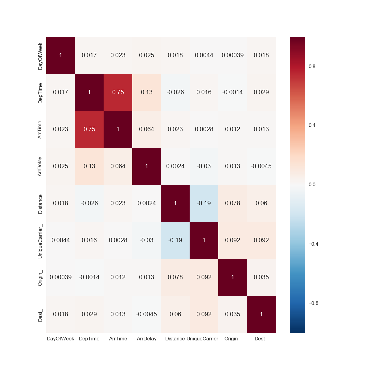
Interesting: Distance / Origin to Unique Carrier
Pearson's r
Pearson's r is a measure of the degree of linear(!) dependence between two variables

https://en.wikipedia.org/wiki/Pearson_product-moment_correlation_coefficient
Need to look at the individual figures
Arrival Time to Departure Time
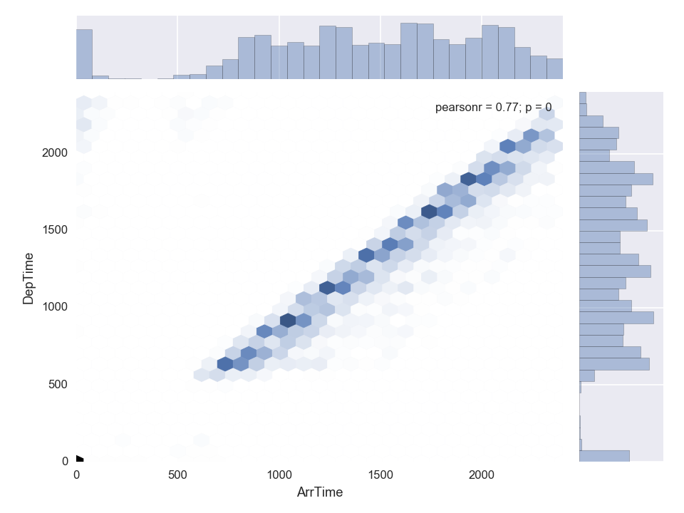
Pearson's r: 0.77, plausible but trivial
Sample Code: 2D Jointplot
seaborn.jointplot(df['ArrTime], df['DepTime'], kind="hex")
Origin to Unique Carrier
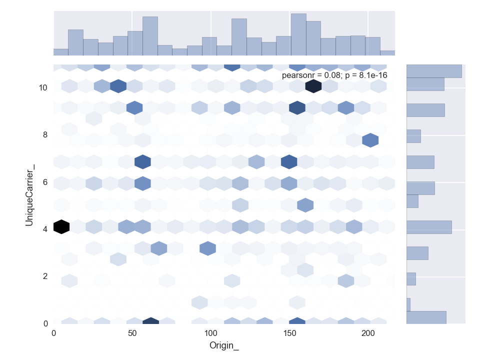
Origin to Unique Carrier
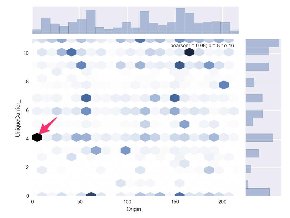
4 = (DL) Delta
Distance to Unique Carrier
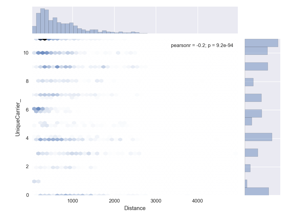
Distance to Unique Carrier
1 = AQ (Aloha Airlines)
Results of Analysis
- Data looks plausible
- Contains obvious correlations
- But also contains non-trivial correlations
- Has timestamps
- Storing and analysing as time series data sounds promising
Isn't this good enough already?
So far
working on random samples only
time series data not exploited
not interactive
Next Step: store data in db to make it flexibly accessible
II: Elasticsearch
Storing and Querying data
Introducing Elasticsearch
https://www.elastic.co/products/elasticsearch
- Search and Analytics Engine
- Indexes and stores structured or unstructured data
- Offers query language to search or aggregate data
Comparing to relational DB
| Relational Database | Databases | Tables | Rows | Columns |
|---|---|---|---|---|
| Indices | Types | Documents | Fields |
Importing our data into Elasticsearch
using pyelasticsearch
Sample Code: Preparing Elasticsearch
Create an index
from pyelasticsearch import ElasticSearch, bulk_chunks
es = ElasticSearch(ES_HOST)
es.create_index(INDEX_NAME)
Sample Code: Preparing Elasticsearch
Create a mapping to make types clear to Elasticsearch
mapping = {
    'flight': {
        'properties': {
            'SecurityDelay': {
                'type': 'integer',
                'null_value': -1
            },
            'Origin': {
                'type': 'string'
            },
            'Cancelled': {
                'type': 'boolean'
            },
            ...
es.put_mapping(index=INDEX_NAME, doc_type=DOC_TYPE,mapping=mapping )
Sample Code: Reading and Cleaning
# reads all data into data frame in memory
df = pd.read_csv('../../data/2001/2001.csv')
# missing value will be filled with -1
df.fillna(-1)
# add a timestamp to each row
df['@timestamp'] = df.apply(lambda row:
    pd.Timestamp('%s-%s-%s;%04d'
        %(row['Year'], row['Month'],
          row['DayofMonth'], row['CRSDepTime'])))
# custom convert cancelled into boolean
df['Cancelled'] = df.apply(lambda row:
    False if row['Cancelled'] == 0 else True)
Checking time series data for the first time
using Kibana adhoc queries
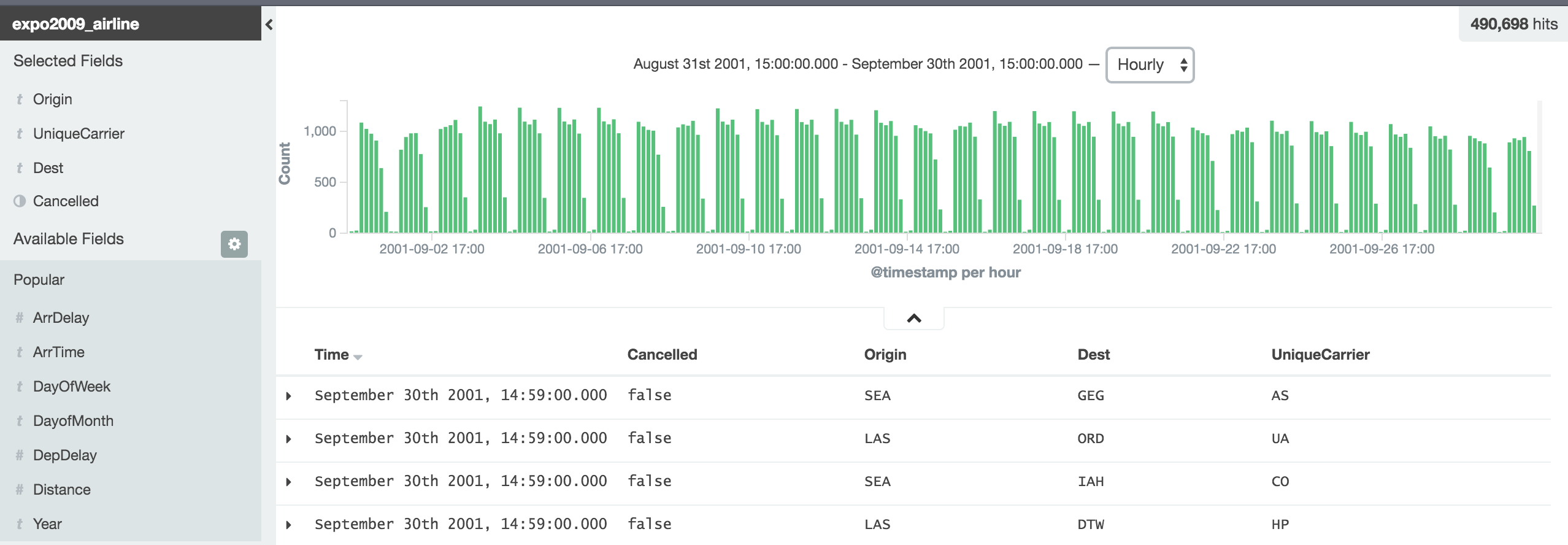
Demo: filter for 'Cancelled:false'
Interactive Dashboards also possible
III: Interactive Exploration in the Browser
But why in the Browser
1: Zero-Installation for the user
2: Interactivity coming naturally
D3.js: Dynamic graphics in the browser
Data based vector graphics (SVG)
Crossfilter: Filtering millions of data sets in real time
- http://square.github.io/crossfilter/
- Can filter up to millions of data sets in real time in the browser
- Loads data in memory
- Data sets are indexed when loaded (also in memory)
- You specify what you want to filter using dimensions
Crossfilter Sample Code
// creating a new crossfilter (multi-dimensional dataset)
// flights array contains all flights for a single month
flight = crossfilter(flights);
console.log(flight.size()); // 490698
// creating a dimension for all carriers of all flights
carrier = flight.dimension(d => d.UniqueCarrier);
// group() reduces this dimension to distinct values
var distrinctCarriersGroup = carrier.group();
console.log("Distinct carriers: " + distrinctCarriersGroup.size());
// 12
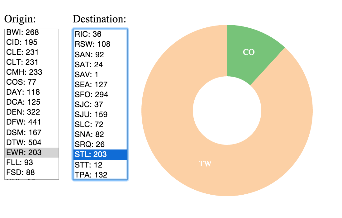
// filter just for TW
carrier.filter("TW");
// groupAll() creates a group intersecting all current filters
// Trans World Airlines, became part of American Airlines in 2001
console.log("TW flights", flight.groupAll().value()); // 19427
// display first 10 matches
console.log(flight.top(10));
Could even be used as an interactive REPL in the browser
dc.js: Charting with D3 and Crossfilter
- http://dc-js.github.io/dc.js/
- Prebuilt integration of D3 and Crossfilter
- offers a couple of diagram types that are useful for exploring data
- bar
- pie
- many more
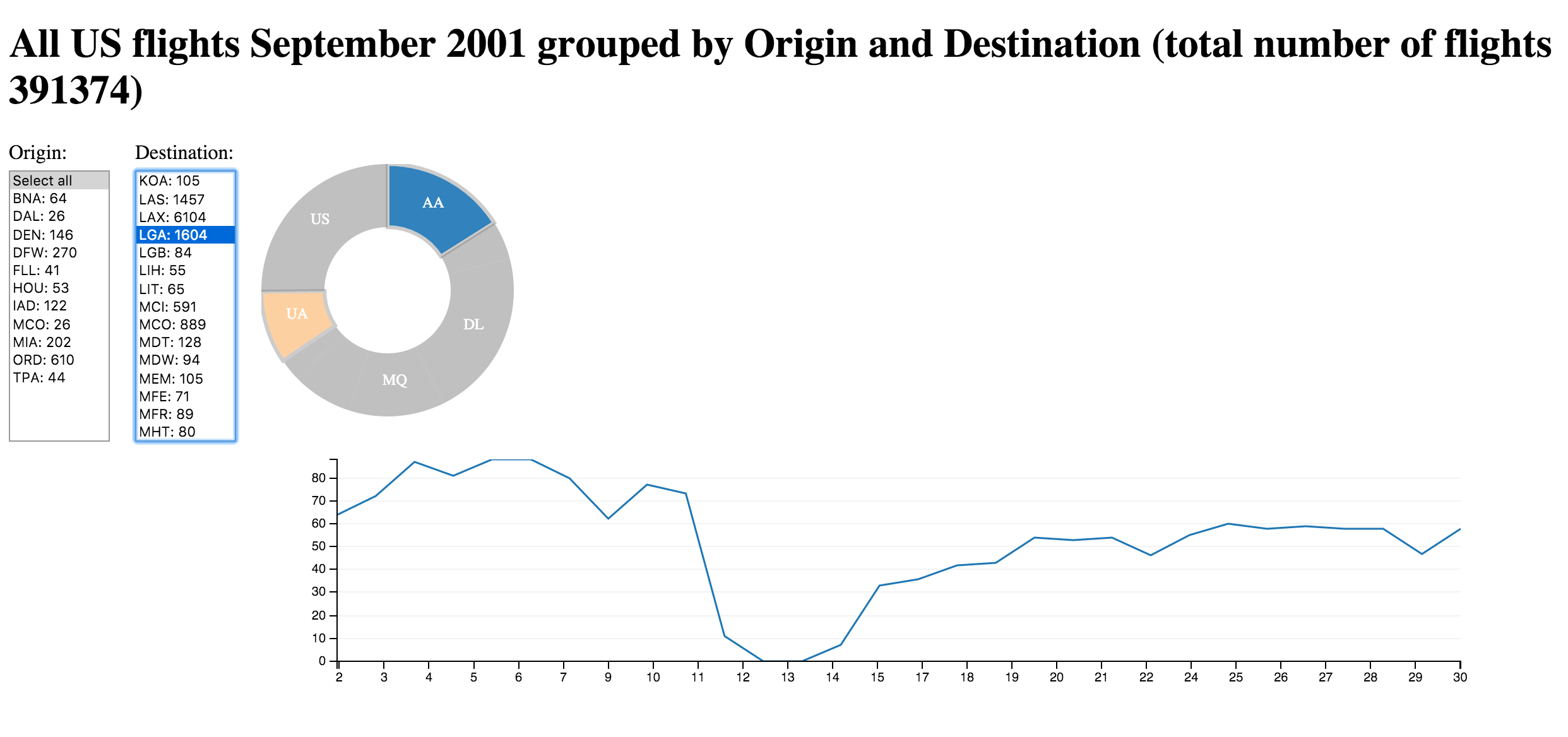
Initial Design of our Dashboard
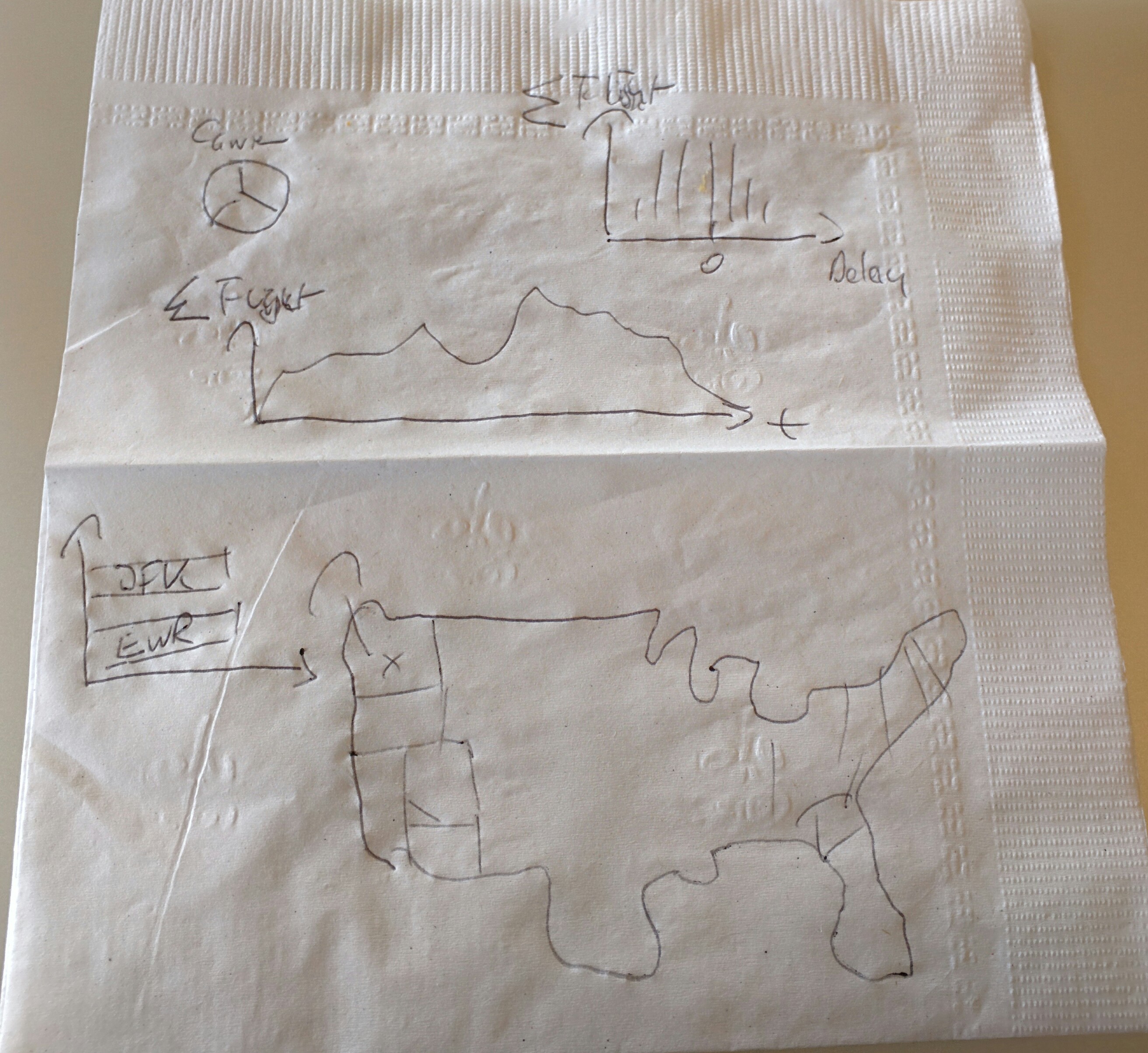
Part #1: Order
Ordering Values: Possisbly first pie chart ever
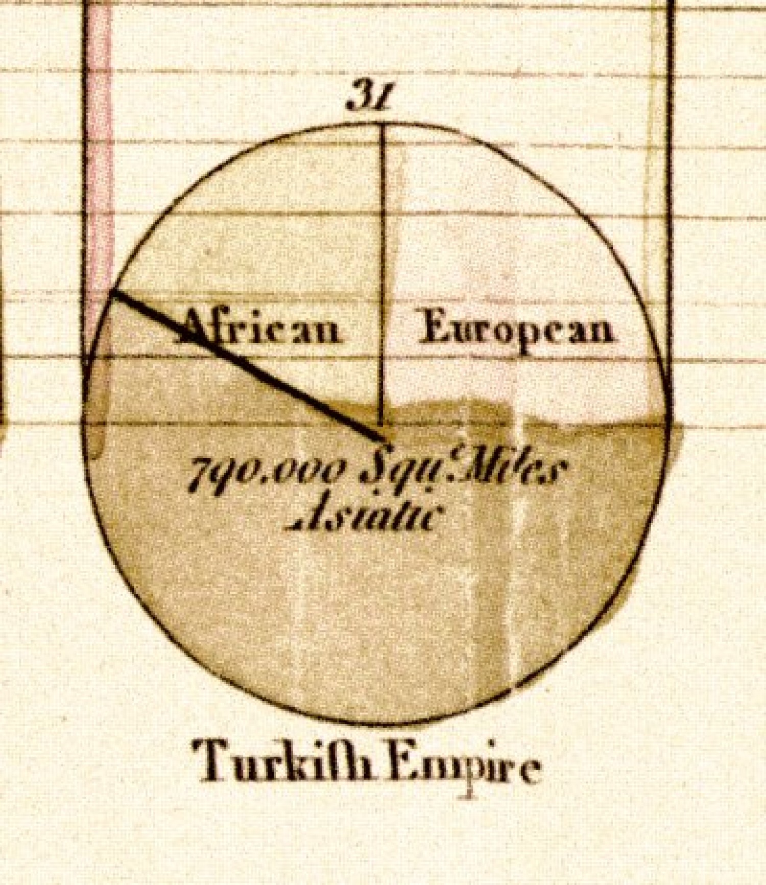
http://blog.visual.ly/12-great-visualizations-that-made-history/
Display Carriers as a Pie Chart
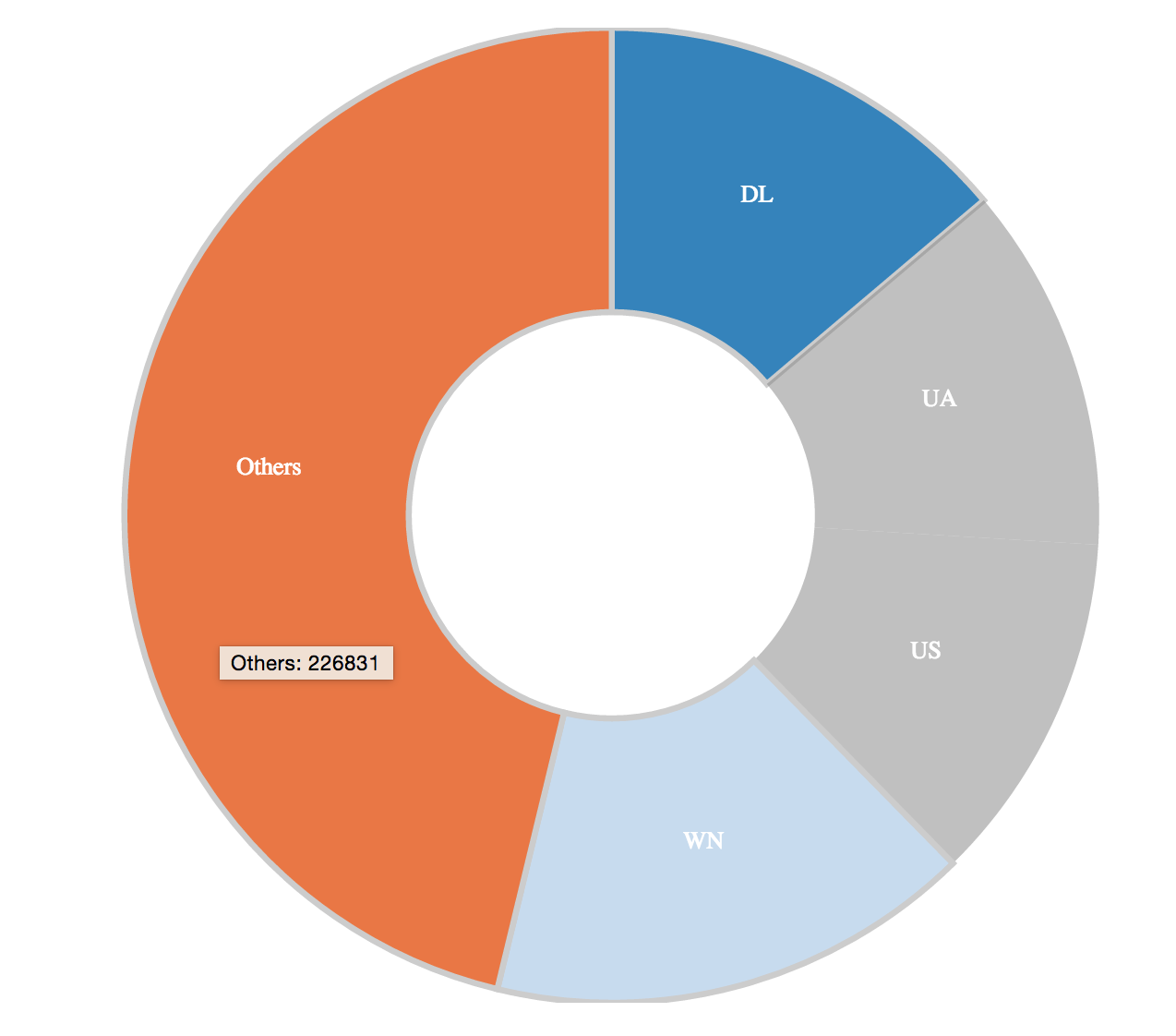
Code for creating the pie chart
var pieChartCarriers = dc.pieChart("#pie");
pieChartCarriers
        .slicesCap(5)
        .dimension(carrier)
        .group(carrier.group().reduceCount());
Part #2: Connections
Origin, Destination, Carriers combined
Try showing your #data from another perspective with #dataviz

Part #3: Time
Time Series: London Underground ad from 1928

Filtering using Brushes
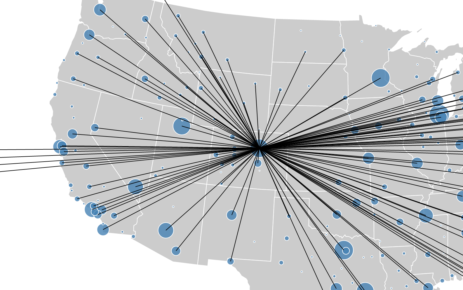
Part #4: Map
All flights from Hawaii
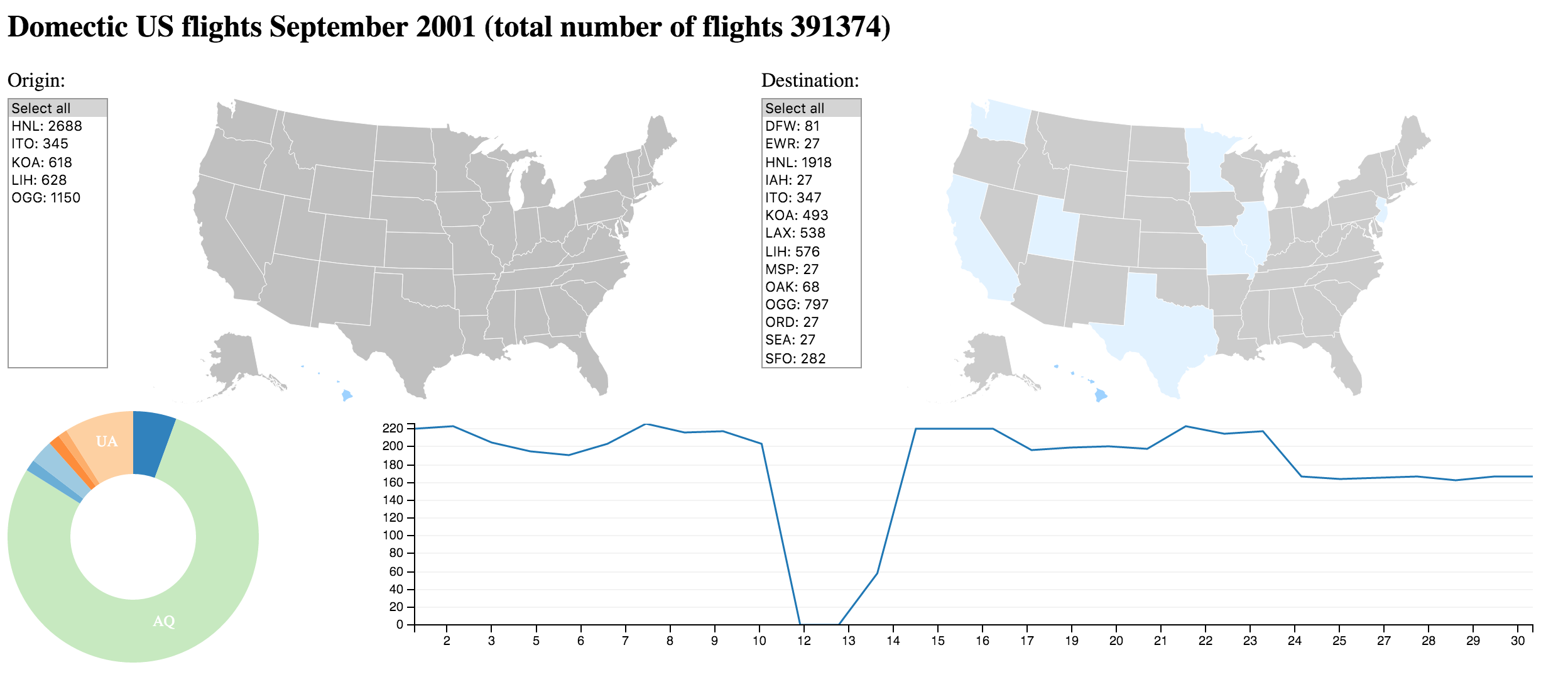
Mixing Different data sources
- sometimes you need to mix data from different sources
- in our case: states airports are in, and airport codes
- states are not in our original data
- so we load both data and merge
- additional dimensions for the state
- can be done at display time
- Possible by total freedom due to using plain JavaScript here
- Using just Pandas might have required this data at import time
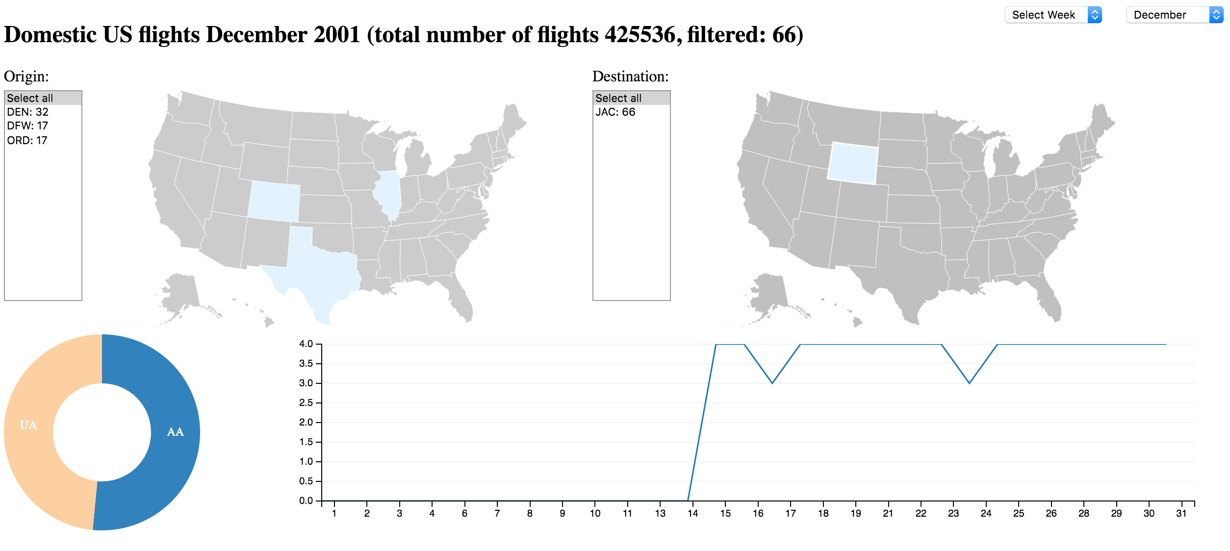
Previous examples worked on data dumps, not on dynamic queries to Elasticsearch
D3 loading Segments from ELK
- Elasticsearch delivers data over HTTP/JSON using query
- D3/Crossfiler/DC displays partition of data
- Partition could be month
- Manually selected by user
Literally no one flying to Wyoming first half of December???
IV: Data Exploration Examples
Coming back to questions from low level analysis in first part
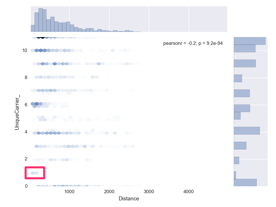
Why only short flight distances for Carrier Aloha Airlines (AQ)?
Answer
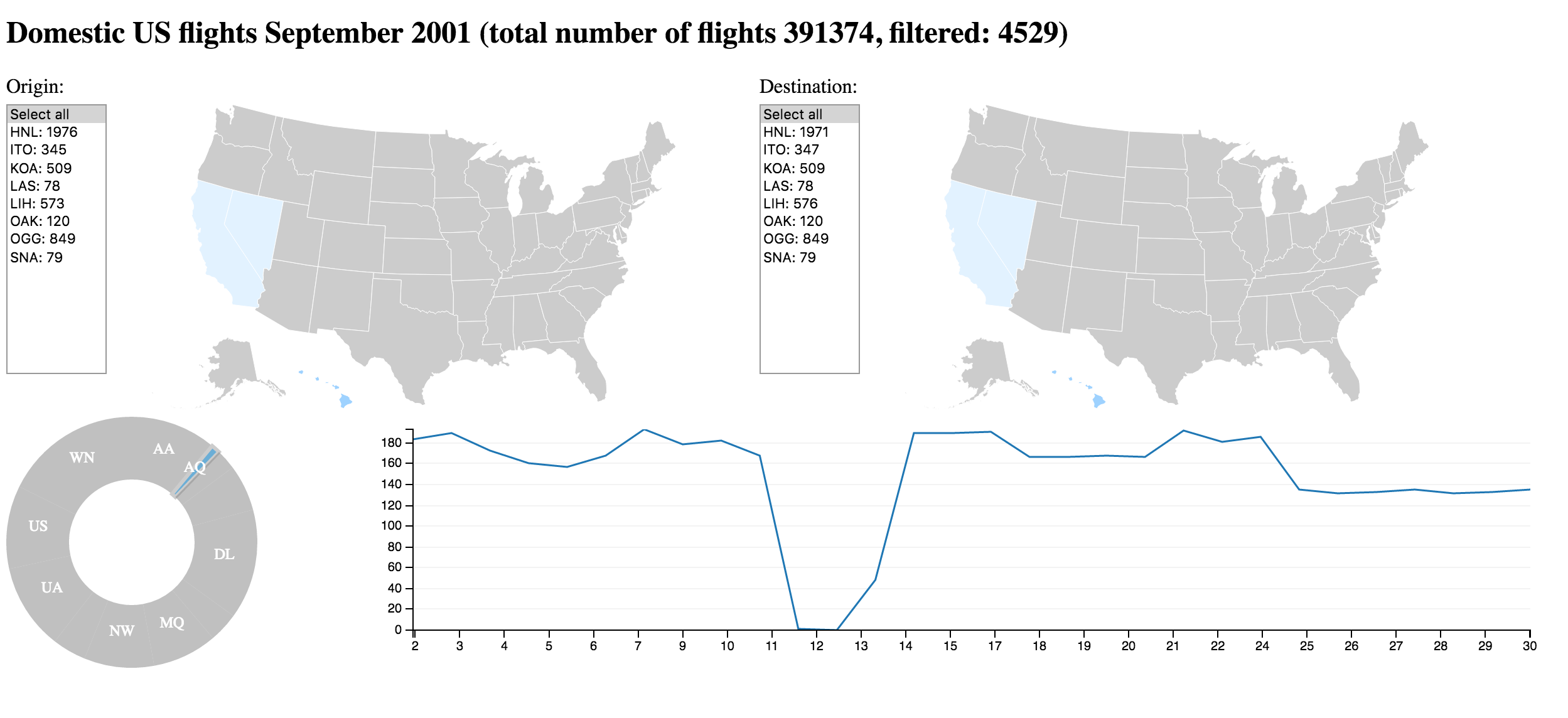
Aloha Airlines (AQ) mainly flies between Hawaii and West Coast (California/Nevada)
What is the prominent Origin for Carrier Delta (DL)?
Answer
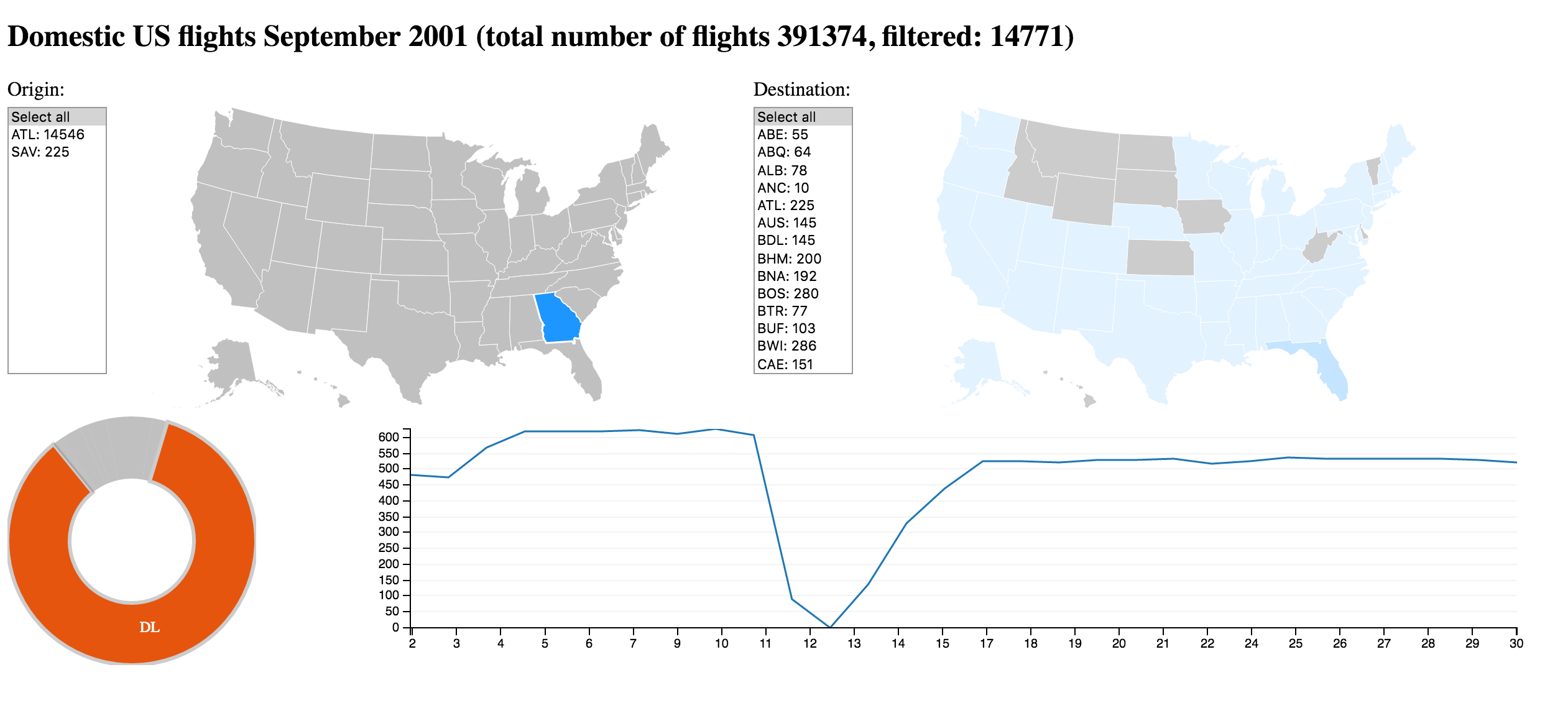
Delta (DL) mainly flies from Atlanta (ATL) its headquarter and largest hub
Wrapup
- Python based tools are most advanced in low level data analysis
- They can be used to prepare data and give an analytical overview
- Pyelasticsearch allows to push that data into Elasticsearch
- Elasticsearch allows for very flexible and fast queries on large amounts of data
- The Browser is the ideal platform to explore data
- D3, crossfilter, and DC help you to interactively explore your data visually
- Elasticsearch can deliver data in chunks the Browser can digest
Your turn
Do you have (possibly large) data set worth exploring?
Best to have it as a CSV or similar (because that might be the hardest and most boring part)
Maybe try some of the techniques described here
Complete Code: https://github.com/DJCordhose/big-data-visualization/tree/gh-pages/code
Slides: http://bit.ly/data-exploration-javazone
Ping me for questions / help / comments: Oliver Zeigermann / @DJCordhose
Bonus Level: How to Start Experimenting?
Try out analysis part (requires numpy, pandas, matplotlib, seaborn, sklearn to be installed)
python big-data-visualization/code/es/analysis_pandas.pyTry crossfiler as an interactive console
Like Jupyter Notebook, but without installation in the browser
Open interactive console (Chrome is my recommendation)
Question: What is the longest departure and the longest arrival delay?